Fourth Week Mobile Game Progress Update
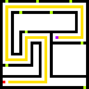
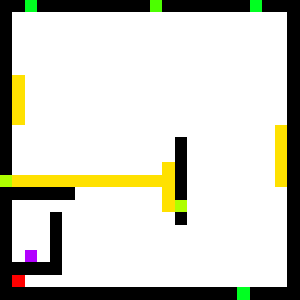
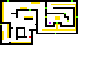
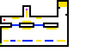
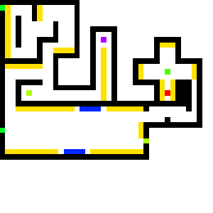
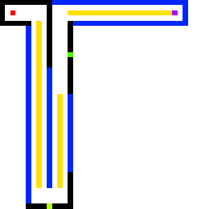
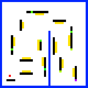
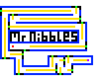
Another week, another progress update. As usual you can check out the progress above (use the arrow keys to move and jump).
This week has mostly been about all the remaining "bits'n'bobs" that go into a game. That includes level progression, scoring, level and stage unlocking, persistence, settings, audio, pause and resuming, player death, fonts and a whole host of other small things.
Moh my artist partner on this project arrived back from his week holiday this week and since back he has made incredible progress getting all the menu screens and the majority of the graphics for the first stage of levels in. I really love the bright cartoony style he has gone for on the menus, the style really works on mobile too. Looks really professional for less than a weeks worth of work (only evenings dont forget).
I have also spent some time sourcing and putting in the rudiments of music and sound effects. The music theme for the game has been supplied by another colleague from Playdemic, Jake Rigby. Before Jake got into game programming he used to make music and audio effects for games (infact he provided some of the audio for my previous flash games) and he was very kind to provide me one of his tracks he made a while back for the project. The sound effects in the game are temporary at the moment, I hope to improve them this week :)
I have also been working hard on trying to get as many levels in as I can. As mentioned previously the idea is to have 30 levels split over three 'stages' each stage will have its own theme and general style of levels. So far I have made the first 10 levels in:
As mentioned in my last update I noticed that people were having trouble understanding how to play the game with the world rotating. To combat that I decided that the first few levels the world were going to be static, doing so should reduce some complexities with the control system. Well I have extended that "few levels" to now mean that the entirety of the first stage doesn't auto-rotate.
What I have done instead is to re purpose some tile types I had originally planned. You are introduced to the first of these new tile types on level 3 of the game. I think it brings that added sense of dimension to the game, making it more than "just a platformer". Play it above and see what I mean, or check out the video I have made of it working on the devices:
Incredibly the game actually runs at a very acceptable 30FPS on my iPhone 3G! Eat your heart out Adobe AIR!
Good level design really is a talent that I admire as I im absolutely terrible at it. It takes alot of time, patience and testing none of which I have in abundance. It is however critical to making this game fun to play so unfortunately I will be concentrating on level design the most of this week. I would love to hear about any feedback you have on the levels, whether they are too hard, too easy, whether the progression is right. It would be a massive help to me and is only something I can get a rough idea by testing myself, it needs others to play test it :)
With that in mind, onto time-scales. In my first post on this project I declared that I was going to finish this game within three weeks. I then extended it by a week due to my artist being out of action for a week. I am now going to extend it by one final week. I am starting to feel really proud of this little game and I think it would be a shame not to put one final weeks worth of polish in before calling it complete. So although I can no longer call it a "three week game" I can be proud to call it "my first mobile game" ;)
