3 Weeks of Progress on a Mobile Game
As usual you can have a play with the game in its current form above. (Up to jump, left and right to control the player).
The first new thing to notice are there are now menus, yey! Incredibly poor, made by a toddler, looking menus, but menus nonetheless. My artist and collaborator on this project, Moh, has been away for the last week so the game has had to suffer at the hands of my terrible programmer art. Now that he is back however, he will be whipping the visuals into shape.
Again this week I have had far less time to work on the project that I was hoping for (damn real life). With the little time I have afforded myself, I mostly concentrated on menus, resolutions, DPIs and aspect rations. These topics are the rather unglamorous side of mobile programming but are a necessary part of writing a game for multiple devices.
First a note on my testing environment and devices:
PC (flash) - 1024x683 @ 72 DPI iPad3 - 2024x1536 @ 264 DPI iPhone 4 - 960x640 @ 326 DPI iPhone 3G - 480x320 @ 153 DPI
(I currently don't have access to an android device but I hope to test on it soon.)
As you can see there is a rather large variation in resolutions and Dots Per square Inch (DPI). There is also two different aspect ratio's there 4:3 for the iPad and 3:2 for iPhone. The iPhone 3GS is the same aspect ratio but half the resolution as the iPhone 4 and the iPhone 4S is the same aspect and DPI as the iPhone 4. The iPad 2 is half the resolution of the iPad 3 but has the same aspect ratio.
Basically all this equates into a few days of headaches while I try to wrap my brain around how to handle this mess. My solution to this conundrum is set my default target to the iPhone aspect ratio of 3:2 as it is more restrictive in the Y direction than the 4:3 ratio of the iPads. If I can build menus that work in 3:2 then they should look okay (if a little bit more spaced out) in 4:3.
To handle the various resolutions within an aspect ratio I then need to provide various versions of the assets that would roughly take up the same amount of screen space at that resolution. So for example if the screen is 1000px wide for example and the title for a menu is 800px wide when I design it on my PC, I would then need to provide a 1600px wide title image when running on a screen 2000px wide.
So the question is now how to provide these various sizes of my title? Well I could make a PNG for my title 800px wide then when I need one 1600px wide I just scale it up by two. The problem with this as anyone who has played around in Photoshop will know is that you will end up with a blurry up-scaled image. The other solution is to start at the other end with the highest quality 1600px then scale it down when you need one 800px wide, the problem with this is that you are wasting a whole load of memory by supplying and loading an image twice the size of whats required. The third method is to provide a different size for every single resolution required, this is not ideal as it would take alot of time to make all these PNGs and there are a great many device resolutions out there.
Haxe and NME however give me an alternative solution. Using the SWF library I am able to design my menus in Flash then at runtime pull out the vector graphic and scale it to the required size to display on screen. What this means is that I only need supply a single resolution of an asset in flash then it is scaled up as a vector and looks great no matter the resolution.
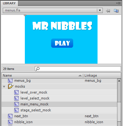
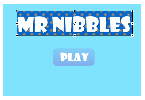
So to work out the correct size for the various parts of the menus initially I created a few "mock screens" in flash and laid out the various parts in the mocks:
By designing the mocks to 960x640 (3:2) I need only then at runtime divide the screen width by 960 to work out the correct scale for the game. Simples!
Well not quite as simples at that. There were a coupple of issues. Firstly the vector rendering performance of NME on mobile is pretty poor. To get around this problem you must pre-raster your vector to a Bitmap first. This should be fairly normal to anyone having worked with Blitting engines in AS3 before. This step however raised another issue.
I noticed it was taking a long time to raster the background for my menus to a bitmap. I did a few experiments and posted the question on the NME mailing list. It turns out that NME currently doesnt handle Radial gradients too well, also performance is generally poor when building in debug mode on iOS. With both this issues rectified however the performance was alot better. There is still a small lag between different menus when on iOS but its acceptable for now.
There also appears to be another issue regarding TextFields on iOS. It appears as if the text is being cut off half way. I have also posted about this issue on the mailing list and am awaiting a reply. My solution for now is to provide a background behind my text set to alpha 0, this forces the width and hight to be correct:
Well with that boring stuff out of the way onto the changes in the game itself.
As mentioned previously the gameplay changes have been fairly minimal. I have made some small changes to how the player is controlled to make it more fun. You can no longer scale vertical cliffs and jumping has been modified. The largest gameplay change has been to how the player is eased into the game.
After watching people play the game on the iPhone and iPad I noticed that alot of the time people didnt seem to understand how to control the player. They assumed the game worked like one of those "move a ball around a maze" type games. So understandably they kept turning the device on its side in an attempt to make the player "go up". With the world constantly rotating too, the person was trying to keep the world level, so they kept twisting the device in odd directions to keep it level. This problem is difficult to explain if you haven't tried it out on a device for yourself.
Once you understand whats going on however (the world is rotating, you tap to jump and tilt to move the player) it all becomes alot more clear and you can play the game normally. So with that in mind I have decided that the first few levels the world will not rotate. I hope this will ease a player into the control system a little better rather than just throwing them at a strange control system in a continually rotating world. Fingers crossed this will do the trick.
So that's that for this week. This week we hope to get as much of the art work in as possible. Hopefully menu systems, and the various bits of artwork for the stages will all go in this week. In addition I want to get audio and testing on Android in. Alot to cover in very little time!

